The simple Carousel widget pulls its slides directly from a specific Photo Album in your Club’s Photo Album Library. For more help with photo albums please click here.
- To access any widget, you need to be logged into your organization's member area. Then, access your webpage editor by clicking on Website and then Website Designer in the top primary navigation menu
- Now click on the orange Edit Content button to edit the main content of your website. This takes you to the Page Designer.
- Once you have opened the Home Page Designer, you can access the Carousel widget on the left side of the screen. It is under the Essentials widget tab.

- Once you drag and drop the Carousel widget into the column you want it to show in, it take you to the widget setup screen.
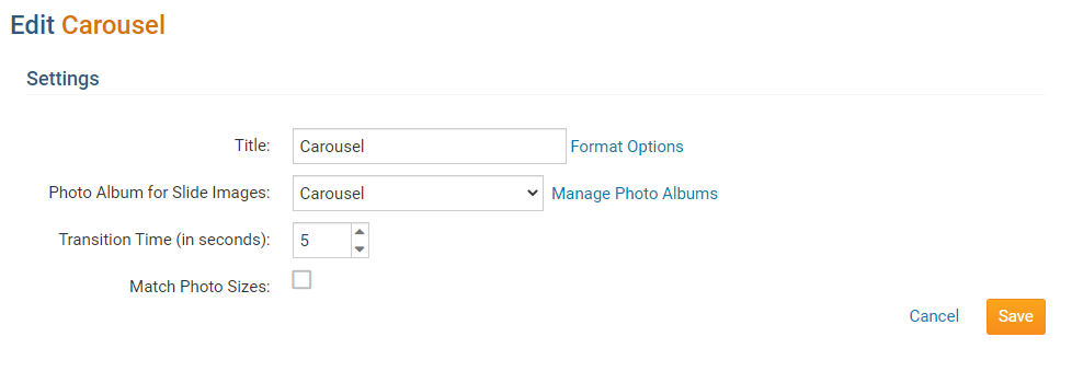
- On the setup screen, you need to fill out / choose the following settings:
- Widget Title: This will be the title of the Widget.
- Photo Album: This is the album that will be used to display photos.
- Manage Photo Albums: This takes you to the photo album library where you can create a photo album to use for the carousel or add/remove photos. To download images for the carousel, please read the article called Carousel Best Practices & Images.
- Transition Time (in seconds): This controls how long a picture is displayed.
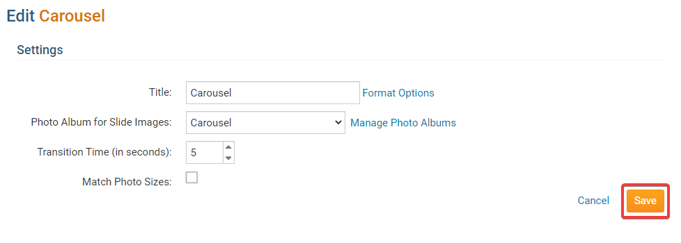
- Click Save once you are done.
- Click on Publish to make your changes visible on the Home Page.
After publishing your changes to the home page, the Carousel Widget will show up shortly after.
Editing Widget Properties
Each widget has a function that permits you to edit the widget properties. Most widgets have standard properties, but some have special rules.
1. To access the widget properties, hover your mouse over the widget once it is in place. Click on the Gear icon when it appears.

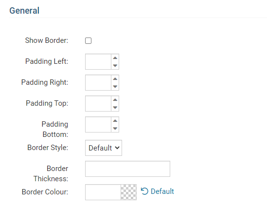
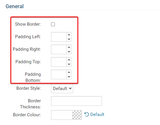
2. You may now edit categories under the various headings. Under the General category you can edit spacing and border properties for the widget's border.
- Show Border: Click this check box if you wish to display a border around the widget.
- Padding Left: Enter a value in pixels to set a space to the left of the widget.
- Padding Right: Enter a value in pixels to set a space to the right of the widget.
- Padding Top: Enter a value in pixels to set a space above the widget.
- Padding Bottom: Enter a value in pixels to set a space below the widget.
- Border Style: Use this drop-down menu to choose a border style.
- Border Thickness: Enter a number to change the border setting. Leave blank to set the default.
- Border Colour: Click on the colour choice window to set a border colour.
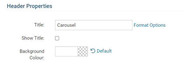
3. In the section marked Header Properties you may customize the appearance of the widget title.
Title: Use this field to enter a new title for the header. This will not change the title of the widget, but rather the heading under which the widget is displayed. You may edit the style and appearance of the text with the format options link to the right of the title field.
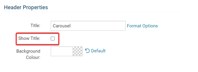
- Show Title: Uncheck this box if you do not wish to display the title.
- Font: Use this drop-down menu to select the font you wish to use.
- Colour: Use this colour selection window to set the colour of the font.
- Background Colour: Use this colour selection window to set the background colour of the font.
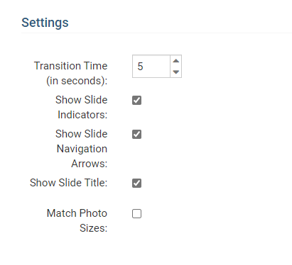
4. The Settings category controls additional functions of the widget.
- Transition Time: This number represents how many seconds it takes to change the picture.
- Show Slide Indicators: Uncheck this to turn off the small circles near the bottom of the pictures
- Show Slide Navigation Arrows: Uncheck this to turn off the arrows that are on the left and right side of the pictures.
- Show Slide Title: Uncheck this to turn off the title of the picture.
Recommended Settings & Notes
It is important to use images that are all the same size for width and height eg: 1600px by 400px or 1920px by 400px, this helps keeps the carousel widget looking consistent where it is placed.
We also recommend hiding the Title, and removing the Padding in the Widget Properties.
- Hover over the widget and click on the Wheel Icon.

- Under General:
- Uncheck Show Border.
- Remove the left, right, top and bottom Padding settings.
- Under Header Properties:
- Uncheck Show Title.
- Uncheck Show Title.
- Click Save.
After making these changes to the Carousel Widget, you should notice that they will show on the home page shortly.
